Not So Boring Bar Charts
An sample of how AI Artwork works, with the help of Ethan Mollick and Midjounrey
How This All Works
People smarter than I have written excellent explainers on how AI works, and more specifically how AI artwork works. I specifically recommend this video from Vox for an accessible breakdown of how this software got created and what it’s future may hold
If you’re really interested in AI, I also recommend the excellent beach read You Look Like a Thing and I Love You by the Janelle Shane.
The crude TL;DR? These softwares take human generated text images and do their best to generate a brand new image, based on what it already knows about existing images.
One of the Best Introductions
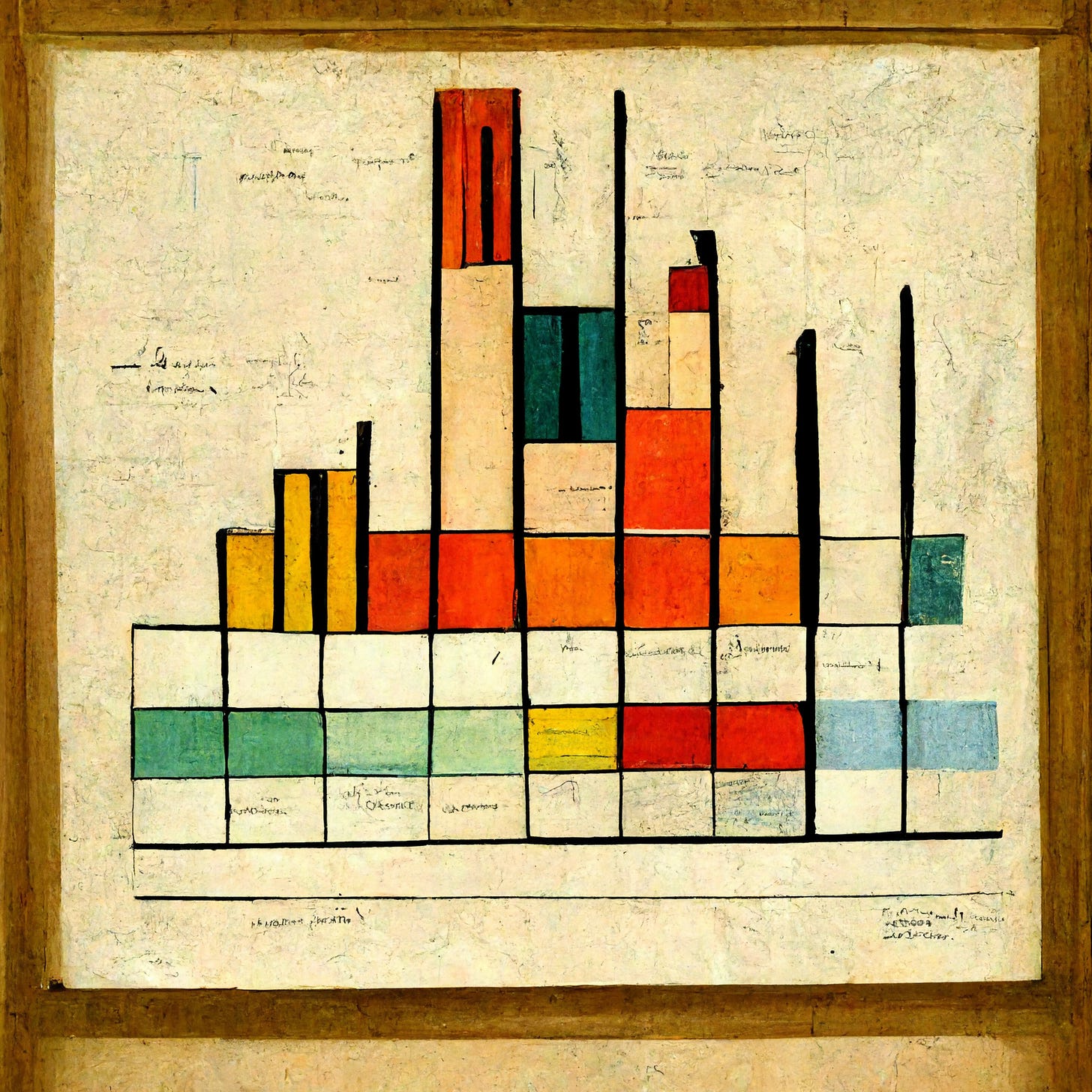
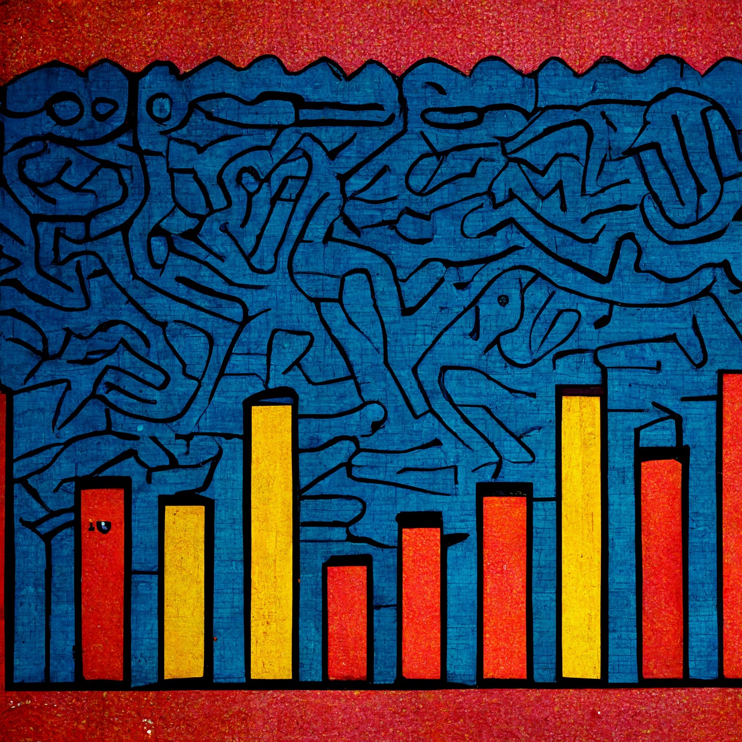
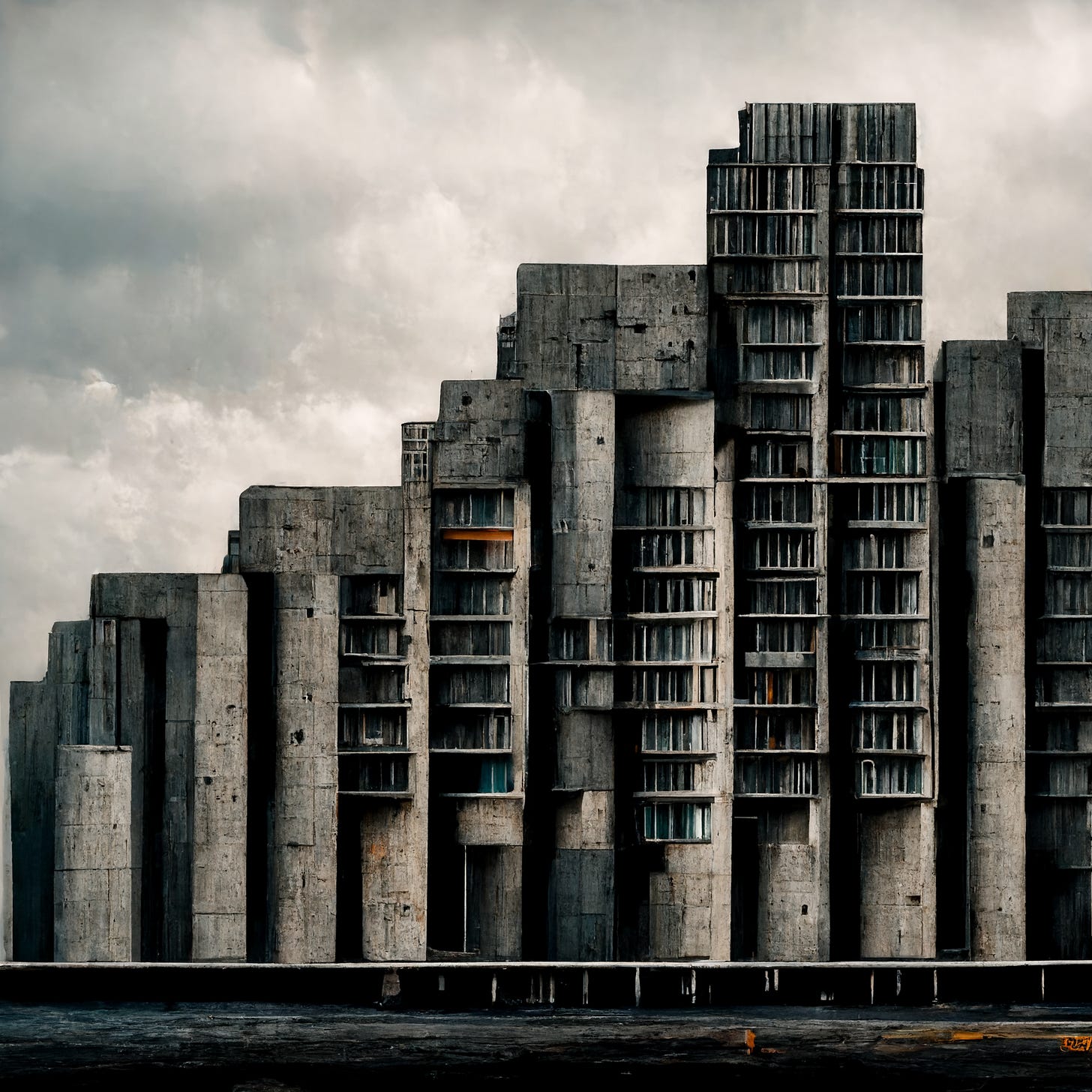
Ethan Mollick is a business professor at Wharton. Aside from that though, his Twitter is a trove of cutting edge research and tech. A few weeks ago, he used the generator Midjourney to put together different bar charts in the styles of specific artists or containing specific objects. As you scroll through the gallery below, take some time to notice what remains the same between each image, and what aspects change. You can find all of his work at this link.
A Collection of Artists
AI Art is good, intuitively, at replicating concrete styles of Artists, like you’ll find below for the likes of Monet and Picasso, but also more opaque styles work like that of movie directors
Abstract Absurdity
This kind of AI is not only good at copying the style of artists, but it is also really good at generating images things that feel a bit absurd. You’ll see some great cases below of that, especially as you approach the end.
Pilot
Thanks for coming on the first ride of this newsletter. If you haven’t already, please subscribe below for weekly emails like this one. It’ll be well worth your time


